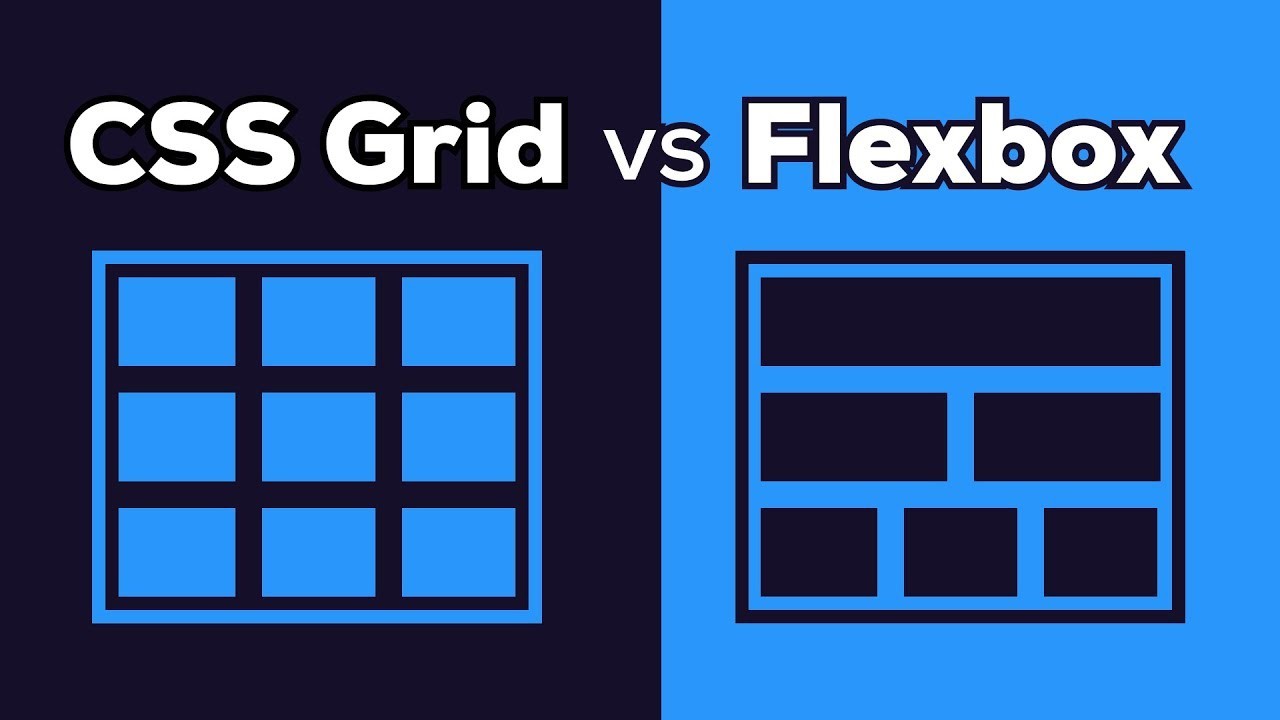
When it comes to crafting modern web layouts, CSS Grid and Flexbox are two powerful tools at your disposal. Each offers unique advantages and is suited for different types of layout challenges. Understanding their strengths and use cases can help you make the right choice for your project. Let’s dive into the key differences between CSS Grid and Flexbox and determine when to use each.
CSS Grid: A Comprehensive Layout System
1. The Power of Two-Dimensional Layouts
CSS Grid excels in creating complex, two-dimensional layouts. It allows you to design both rows and columns simultaneously, giving you precise control over the placement of elements. This makes it ideal for building intricate grid-based layouts where alignment in both directions is crucial.
In my experience, CSS Grid is particularly useful for creating responsive web designs where elements need to span multiple rows or columns. For example, if you’re designing a magazine-style layout with multiple sections and varying widths, CSS Grid provides the flexibility and control needed to achieve a polished result.
2. Enhanced Control with Grid Areas
With CSS Grid, you can define specific areas of your layout using named grid areas. This feature simplifies the process of arranging complex content and makes your CSS more readable. Grid areas are especially helpful for creating structured layouts where the position of each element is clearly defined.
Flexbox: A Streamlined One-Dimensional Layout Tool
1. Flexibility in One-Dimensional Layouts
Flexbox is designed for one-dimensional layouts, focusing on either rows or columns. It’s perfect for distributing space and aligning items within a container. Flexbox is great for simpler layouts where elements need to be arranged in a single direction and need to adapt to varying screen sizes.
From my own projects, I’ve found Flexbox to be invaluable for building navigation bars, form layouts, and simple grids where alignment and spacing are the primary concerns. Its ease of use and intuitive properties make it a go-to choice for many layout scenarios.
2. Responsive Design Made Easy
Flexbox’s alignment and distribution features are particularly useful for responsive design. With properties like justify-content, align-items, and flex-wrap, you can create layouts that adjust smoothly to different screen sizes without extensive media queries.
Choosing the Right Tool for Your Project
When to Use CSS Grid vs. Flexbox
- Use CSS Grid when you need a robust, two-dimensional layout system. It’s ideal for complex designs with both rows and columns, such as grid-based layouts, dashboards, and magazine-style pages.
- Use Flexbox for simpler, one-dimensional layouts where you need to align and distribute items in a row or column. It’s perfect for navigation bars, form elements, and any layout where you want flexible, responsive behavior.
Conclusion
Both CSS Grid and Flexbox are powerful tools for web design, each with its own strengths and ideal use cases. By understanding their unique features, you can choose the right layout tool to suit your project’s needs and create beautifully responsive designs.
Ready to deepen your knowledge of CSS layout techniques?
Our upcoming Bootcamp offers hands-on training in advanced web design and development. To take part in the Bootcamp, register now.


