In today’s data-driven world, the ability to transform raw data into compelling stories is crucial for effective communication. Whether you’re a beginner just starting out or an expert refining your skills, mastering data visualization techniques can significantly enhance how you present information. Here’s a look at various methods and tools that can help you turn complex data into engaging narratives.
Techniques for Effective Data Visualization
1. Choosing the Right Visualization
Selecting the right type of visualization is key to conveying your message clearly. Common options include bar charts, line graphs, pie charts, and scatter plots. Each has its strengths and is suited to different types of data.
For example, a pie chart might be useful for displaying percentage-based data, while a line graph is better for showing trends over time. During a project with clients in Lagos, using the appropriate visualizations helped us present complex data in a more digestible format.
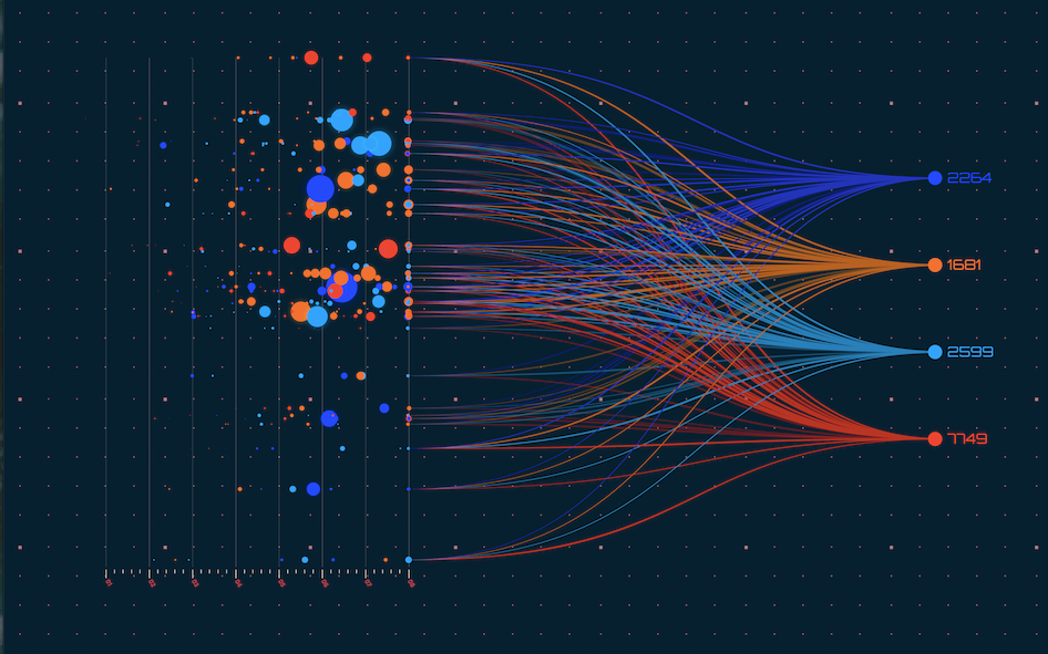
2. Data Visualization Tools
There are numerous tools available for creating data visualizations, from simple tools like Excel to more advanced ones like Tableau and Power BI. These tools offer various features to customize and enhance your visualizations.
In my experience working with professionals in Abuja and Port Harcourt, tools like Tableau proved invaluable for creating interactive and dynamic dashboards that provided deeper insights into the data. The right tool can make a significant difference in how effectively your data is communicated.
Best Practices for Engaging Visuals
3. Design Principles
Good design principles are essential for creating engaging visuals. This includes using clear labels, choosing appropriate colors, and ensuring that the visualizations are easy to interpret. Avoid clutter and focus on presenting the most relevant information.
For those starting in data visualization, focusing on these basic design principles can greatly improve the quality of your work. Intermediate users can benefit from experimenting with advanced design features, while experts might focus on optimizing visualizations for specific audiences.
4. Telling a Story
Effective data visualization goes beyond just presenting data—it’s about telling a story. Use visual elements to guide your audience through the data, highlight key insights, and support your narrative.
In a recent project with a client in Ibadan, we focused on creating a narrative around the data to help stakeholders understand the implications and make informed decisions. A well-told story makes the data more relatable and actionable.
Conclusion
Turning raw data into compelling stories requires a combination of the right techniques, tools, and design principles. Whether you’re just starting out or are an experienced professional, mastering these skills can enhance your ability to communicate data effectively and engage your audience.
Interested in expanding your data visualization skills? Our upcoming Bootcamp offers tailored courses for different proficiency levels.
Visit our website to find the perfect Data Analysis course, and start transforming your data into impactful stories today.